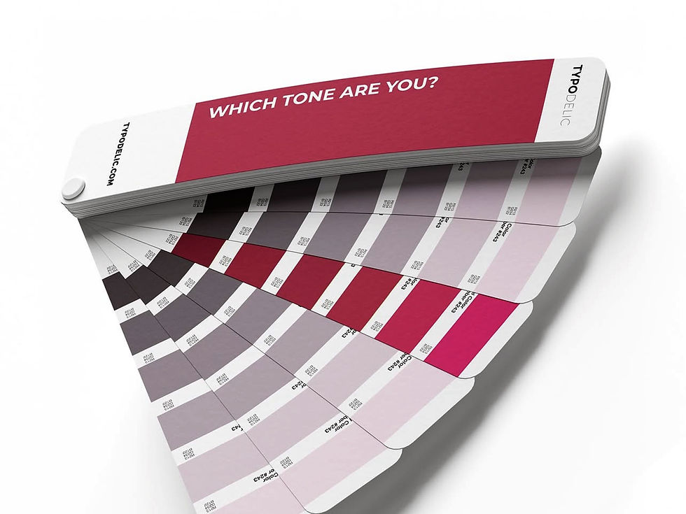
Color Psychology: How does it impact your logo and branding?
- Vasilis Doumanis
- Mar 17
- 1 min read

Color psychology explores how different hues can evoke specific emotions and influence consumer behavior. When it comes to branding, the choice of colors in a logo can significantly impact how a brand is perceived. Each color carries its own set of meanings and associations, which can shape a brand’s identity.
For instance, blue is often linked to trust and reliability, making it a popular choice for companies aiming to establish a sense of security. On the other hand, red can evoke excitement and passion, which is why it’s frequently used by brands looking to grab attention and energize their audience.
Green typically represents growth, health, and tranquility, making it ideal for companies in the wellness or environmental sectors. Meanwhile, yellow brings feelings of optimism and cheerfulness, often used to attract a younger demographic.
Designers must consider not just the individual meanings of colors, but also how they interact with one another. A well-thought-out color palette can enhance a brand’s message and create a cohesive visual identity.
In conclusion, understanding color psychology is crucial for businesses wanting to effectively communicate their brand values and connect with their target audience. By carefully selecting colors for logos and branding materials, companies can foster the desired emotional responses and strengthen their market presence.
How TYPODELIC can help?
If you are interested in an efficient repositioning for your brand, contact us today on 00306932310499 to explore all options in a free 30' consultation.
